It’s easy to blur the lines between art and design. Both disciplines involve personal vision and creative thinking, but the core difference lies in why they are created and for whom.
Design is not simply art with a function but it’s a discipline rooted in solving problems, meeting real needs, and serving people. While it may carry traces of personal expression, its main goal is to work for someone else. Art is deeply personal. It exists to express a vision, provoke emotion, or spark a conversation. Artists create for themselves or for an abstract audience, often without concern for how the work is used in daily life.
Design, on the other hand, is both expressive and practical. A designer still brings personal insight and creativity, but always in dialogue with the user. The audience is real people, with real needs.
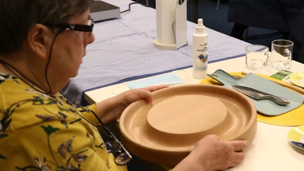
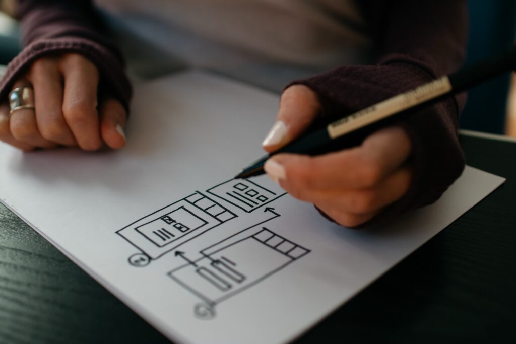
This balance is what makes design so powerful and challenging. Unlike art, which thrives on ambiguity, design must be tested, refined, and often compromised to make sure it’s useful, usable, and meaningful in a real-world context. Designing a product, a service or a space takes a lot of responsibility as well. Because if a designer often thrives to come up with authentic and innovative work, they are also responsible for how people are going to interact with it. A design needs to provide a clear function to the user, that’s why it is important to listen to people and understanding them. That means research, testing, feedback, and iteration. The final outcome may feel universal and “obvious,” but the simplicity of many design projects are usually the result of a complex, often messy, process of trial and error.
Design isn’t about decoration but has in its roots in its willingness to create an impact in everyday life by solving real problems. But of course, as artistic expressions also the best design solutions often emerge from a personal point of view, a unique angle on the world that allows the designer to see opportunities others might miss.
My own experience at Design Academy Eindhoven shaped how I view this balance. The program was highly conceptual, almost artistic in its approach. We were encouraged to think deeply, to research widely, and to question everything. I learned how important it is to ask why a product should exist, what role it plays, and how it relates to society. But in retrospect, the focus was heavily focused toward ideation and experimentation, with less emphasis on production realities, user testing, and market viability.
After graduation, I had to teach myself how to adapt my ideas to actual constraints: manufacturing processes, user expectations, legal protections, sustainability, and how the market works.
It’s not about finding which, between design and art, is superior but it is important how both parts operate and interrogate the world in a different way, and at the end of the day you just choose the version that speaks better to you. Moreover often design and art can melt together and the borders between these two disciplines become less noticeable. For me, the biggest lesson I’ve learned, as a designer, is that successful design combines personal perspective with practicality. You start from a point of curiosity or passion, but then you zoom out, to see if your idea resonates beyond yourself, while refining and testing. That’s what sets design apart from art. Creating experiences that others can use, value and love in their daily life.